What Is BEM?
BEM stands for Block, Element, Modifier. It’s a naming convention for CSS classes that makes your code more readable, predictable, and scalable. Nothing more, nothing less.
The idea is simple: instead of making up class names as you go, you follow a consistent pattern that tells you exactly what an element is, where it belongs, and what state it’s in.
Block
A Block is a standalone component. It’s a meaningful, self-contained piece of your UI. Think of it as the parent.
Examples: card, nav, hero, btn
.card { ... }
.nav { ... }
.btn { ... }
A block makes sense on its own. You know what it is just by looking at the name.
Element
An Element is a part of a block. It belongs to its block and has no meaning outside of it. Elements are written with two underscores after the block name.
.card__title { ... }
.card__image { ... }
.card__body { ... }
.nav__item { ... }
.nav__link { ... }
The double underscore tells you: this is a child of the block before it. card__title is the title inside a card. nav__link is a link inside the nav. Simple.
Modifier
A Modifier changes the appearance or state of a block or element. Modifiers are written with two dashes after the block or element name.
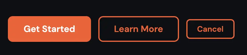
Let’s take the button as an example. You have a base .btn class, and then different variants:
/* Base button */
.btn {
  padding: 12px 24px;
  border-radius: 6px;
  font-weight: 600;
}

/* Modifiers */
.btn--primary {
  background: #e8643a;
  color: white;
}

.btn--outline {
  background: transparent;
  border: 2px solid #e8643a;
  color: #e8643a;
}

.btn--small {
  padding: 8px 16px;
  font-size: 13px;
}
In your HTML it looks like this:
<button class="btn btn--primary">Get Started</button>
<button class="btn btn--outline">Learn More</button>
<button class="btn btn--outline btn--small">Cancel</button>
Notice that you always keep the base class btn and add the modifier on top. That way the base styles always apply, and the modifier only changes what’s different.
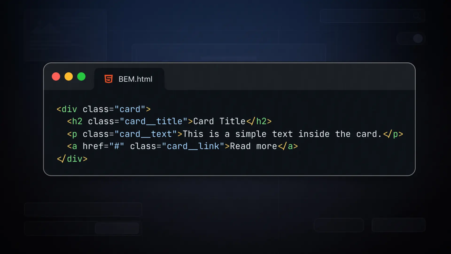
A Full Example
Here’s how a card component looks with BEM:
<div class="card">
  <img class="card__image" src="..." alt="...">
  <div class="card__body">
    <h2 class="card__title">Article Title</h2>
    <p class="card__text">Some description text here.</p>
    <a class="btn btn--primary" href="#">Read More</a>
  </div>
</div>
.card {
border-radius: 8px;
overflow: hidden;
&__image { width: 100%; display: block; }
&__body { padding: 24px; }
&__title { font-size: 1.25rem; font-weight: 700; }
&__text { color: #666; margin-top: 8px; }
}Just by reading the class names, you know exactly what everything is and where it belongs.
What About Tailwind?
If you’ve worked with Tailwind CSS, you might be thinking: “I don’t use class names like that at all.” And that’s correct. Tailwind is utility-first, meaning you style elements by combining small, single-purpose classes like flex, pt-4, text-center directly in your HTML. There are no component names, no BEM structure.
Tailwind and BEM solve different problems. Tailwind works great in component-based frameworks like React or Vue where your markup stays close to your styles. BEM is the better choice when you’re writing custom CSS, working with a page builder, or building a design system where reusable, named components matter.
In Bricks, you’re writing real CSS classes. BEM fits naturally into that workflow.
Why BEM Is Worth It
Without a naming convention, CSS quickly becomes a mess. You end up with classes like .title, .title2, .new-title, .title-blue and after a few months nobody knows what belongs where, including yourself.
BEM forces you to think about structure before you write a single line of CSS. That discipline pays off every time you need to maintain, extend, or hand off a project.
- BEM stands for Block, Element, Modifier — a naming convention for CSS classes
- Block is the standalone component (e.g. .btn, .card, .nav)
- Element is a child of the block, written with two underscores (e.g. .card__title)
- Modifier changes the look or state, written with two dashes (e.g. .btn–primary, .btn–outline)
- Always keep the base class and add the modifier on top, never replace the base class with the modifier
- Tailwind and BEM solve different problems — BEM is the better fit for custom CSS and page builder workflows
- BEM makes your CSS predictable, readable, and easy to maintain across large projects
